Grouping
In addition to the main filter mechanism, OKA provides on some of its plugins an additional system to facilitate the comparison of multiple categories at once,
instead of having to filter on each of them individually.
This functionality allows data to be grouped based on a selected category and a given number of groups to be displayed.
When grouping data, the first N groups (the number specified by the user) representing the most jobs for the current filtering will be displayed individually.
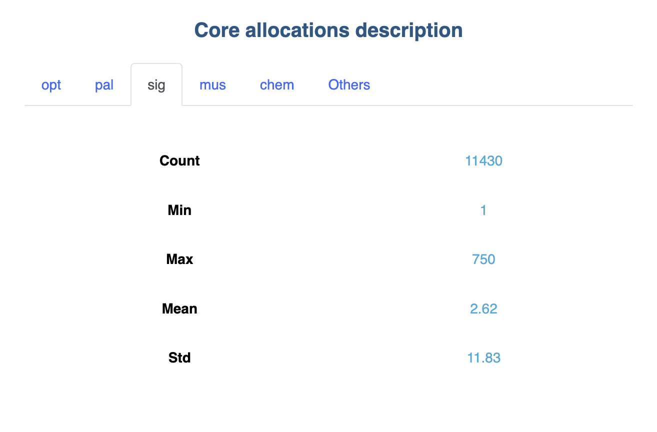
All other elements available for the selected category will be combined and displayed as a single group named Others.
UI
Grouping is available through a dedicated button on the right side of the top bar.
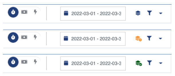
As shown in the following picture, current state is reflected on the Grouping icon.
If any unapplied changes are made, the icon turns orange and a small ! icon is added.
Once a grouping is requested and applied, the icon turns green and a small ✓ is added.
Otherwise, the icon is blue.
When you click on the grouping icon, a panel allowing you to select the grouping category as well as the number of groups you want is displayed:
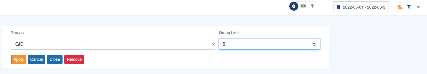
To group data, you need to specify:
Groups: A dropdown containing all the categories for which grouping is possible.Group limit: The number of individual groups to display,Ngroups +Others. If the number of element in the selected category is less or equal toN, only individual groups will be displayed.
The following actions are available through the buttons:
Apply: Confirm grouping with selected inputs.Cancel: Cancel changes in selected fields. Revert to previous configuration.Close: Close the panel.Remove: Clear the current grouping configuration.
Examples
Line and Scatter Graphs
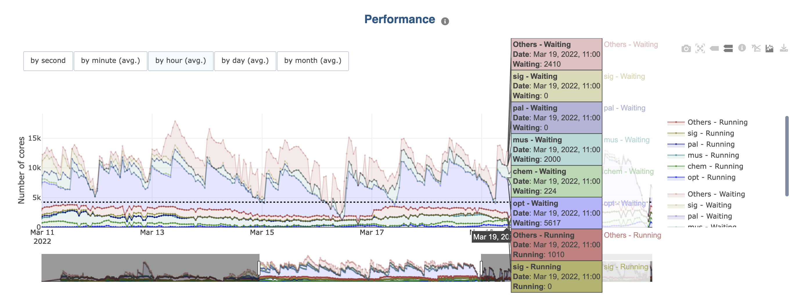
By clicking on the legends, a group can be removed from the graph or added back.
If the initial graph already contains multiple categories (e.g., in Load the Cluster load displays “Running” and “Waiting” cores):
Legends are grouped per category (e.g., running and waiting). You can hide/show them all at once by clicking a category element in the legend.
Colors are the same for each group in each category, but the opacity of the colors in one of them is reduced.
Bar Graphs
There are multiple cases for bar charts:
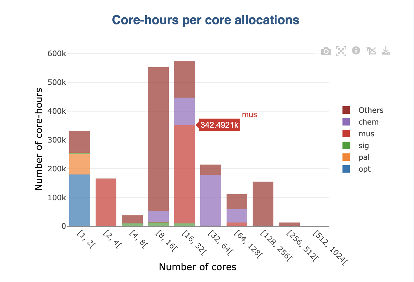
By default, the grouping is displayed as a stack on graphs (see picture above). This is the case for all values that can be summed (e.g., number of jobs):
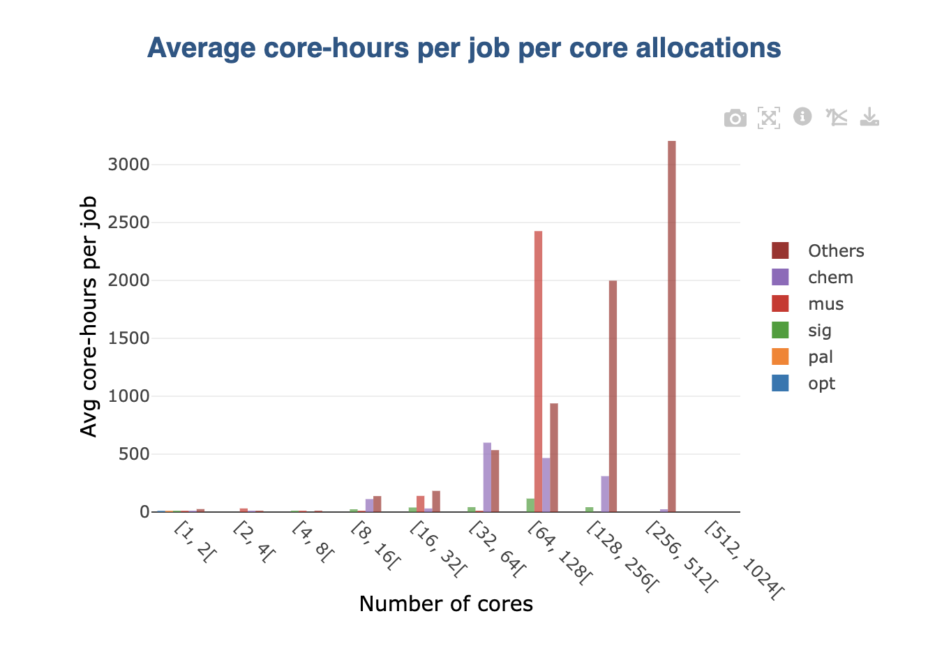
When a non-summable is displayed in the original graph (e.g., averages), stacking wouldn’t make sense. In this case, groups are displayed side by side:
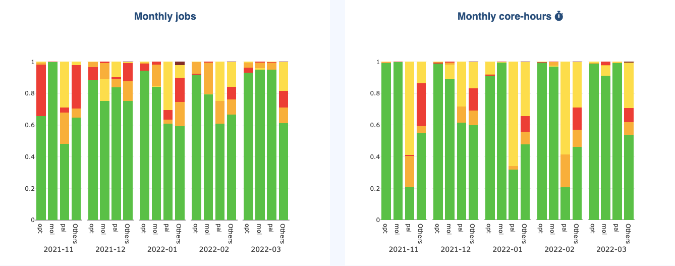
If the original graph already displays stacked values (e.g., job status per month), then the selected grouping is shown as subgroups displayed side by side:
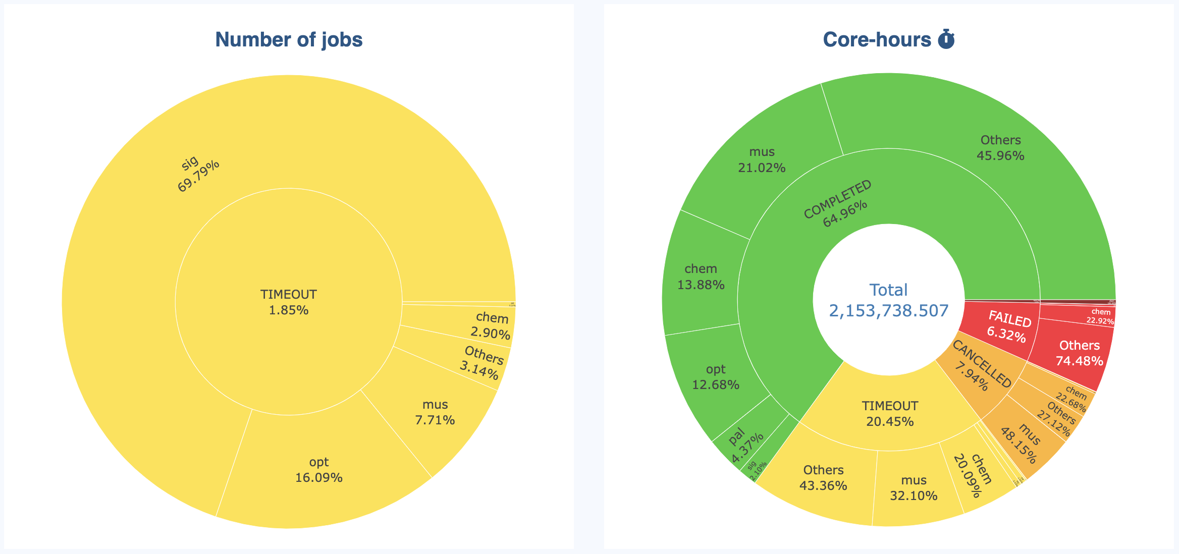
Sunburst Graphs
Sunburst graphs allow to visualize hierarchical data spanning outward radially from root to leaves. It is an “extension” of more classical Pie charts. The inner ring displays the initial data, while the outer ring displays the grouping for each category present in the inner ring:
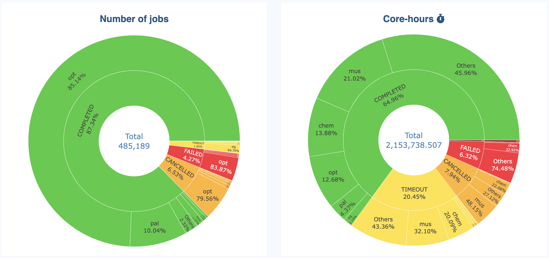
The sunburst allow to see the details in an interactive way. You can hide categories in the inner ring to “zoom” on the other categories:
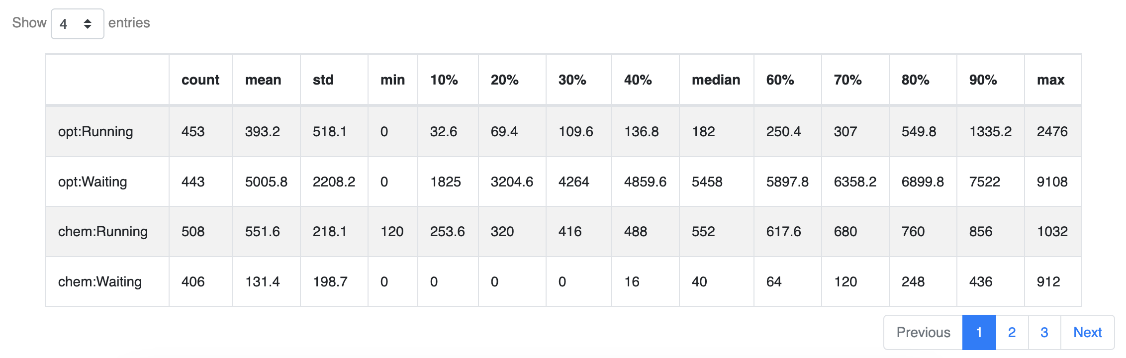
Tables
Groups are displayed in tables as separate rows. Note that since the number of rows will increase, pagination becomes may active when grouping.
Tabs
When information is displayed in a specific cell on a page, additional tabs are added to present the information group by group: